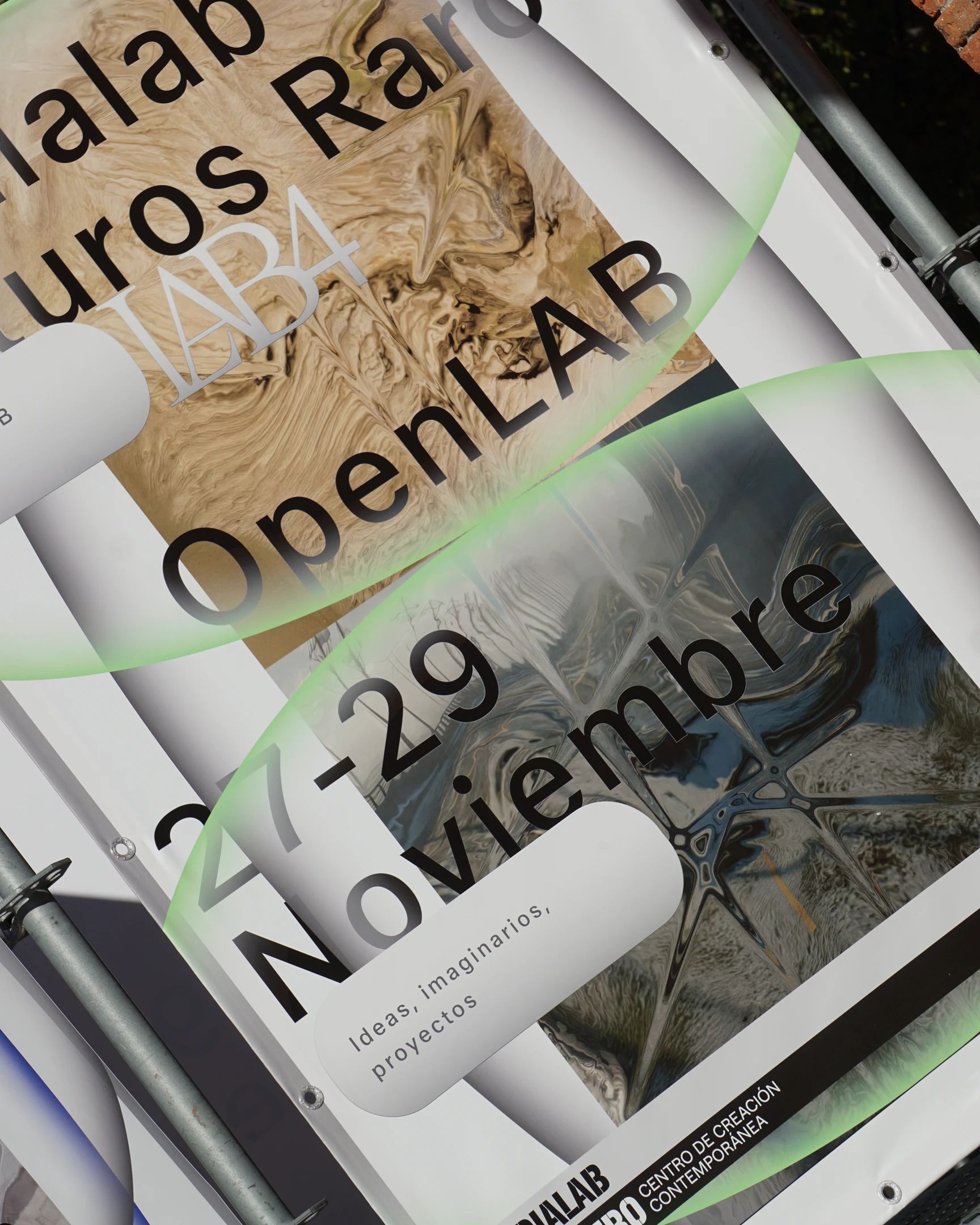
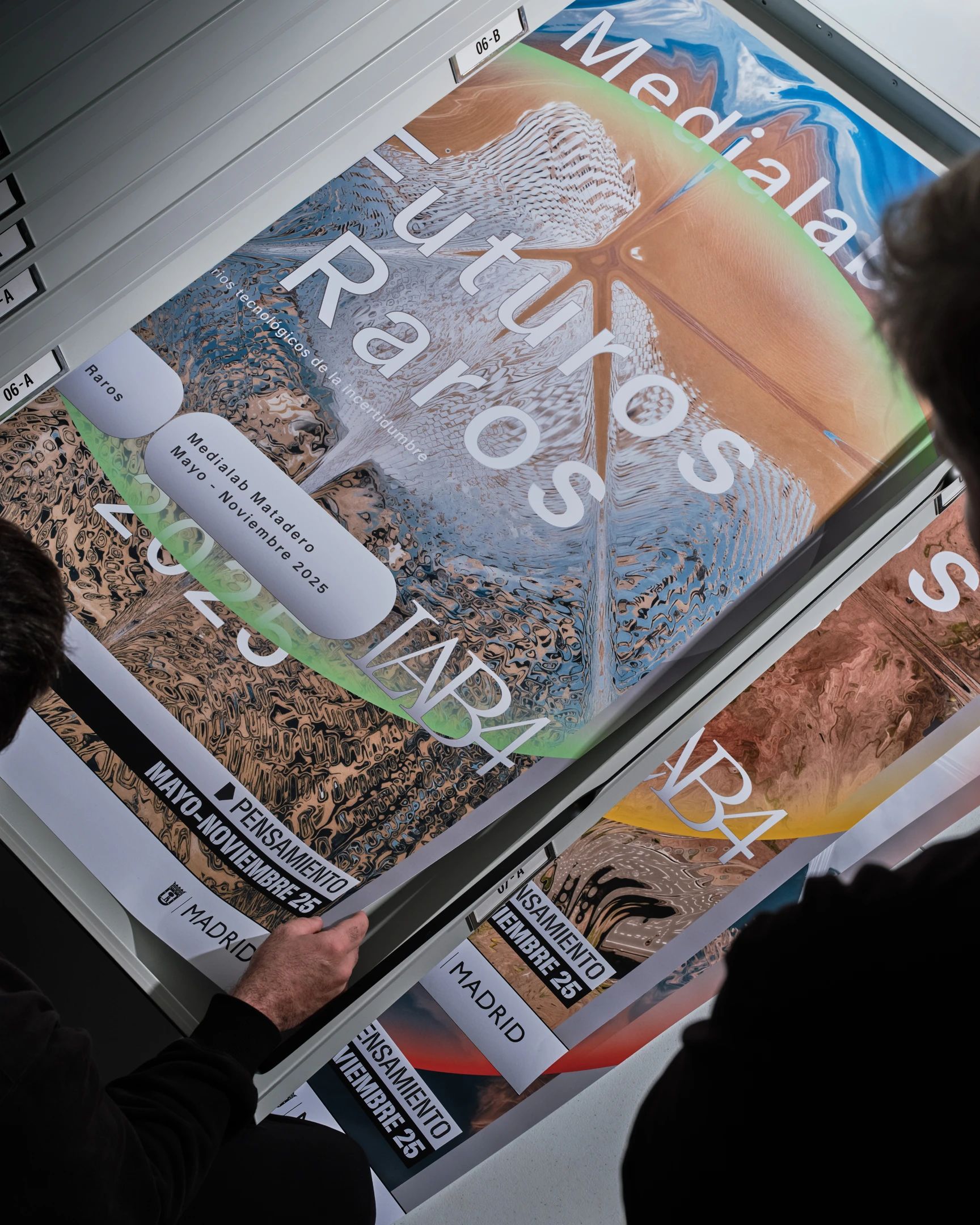
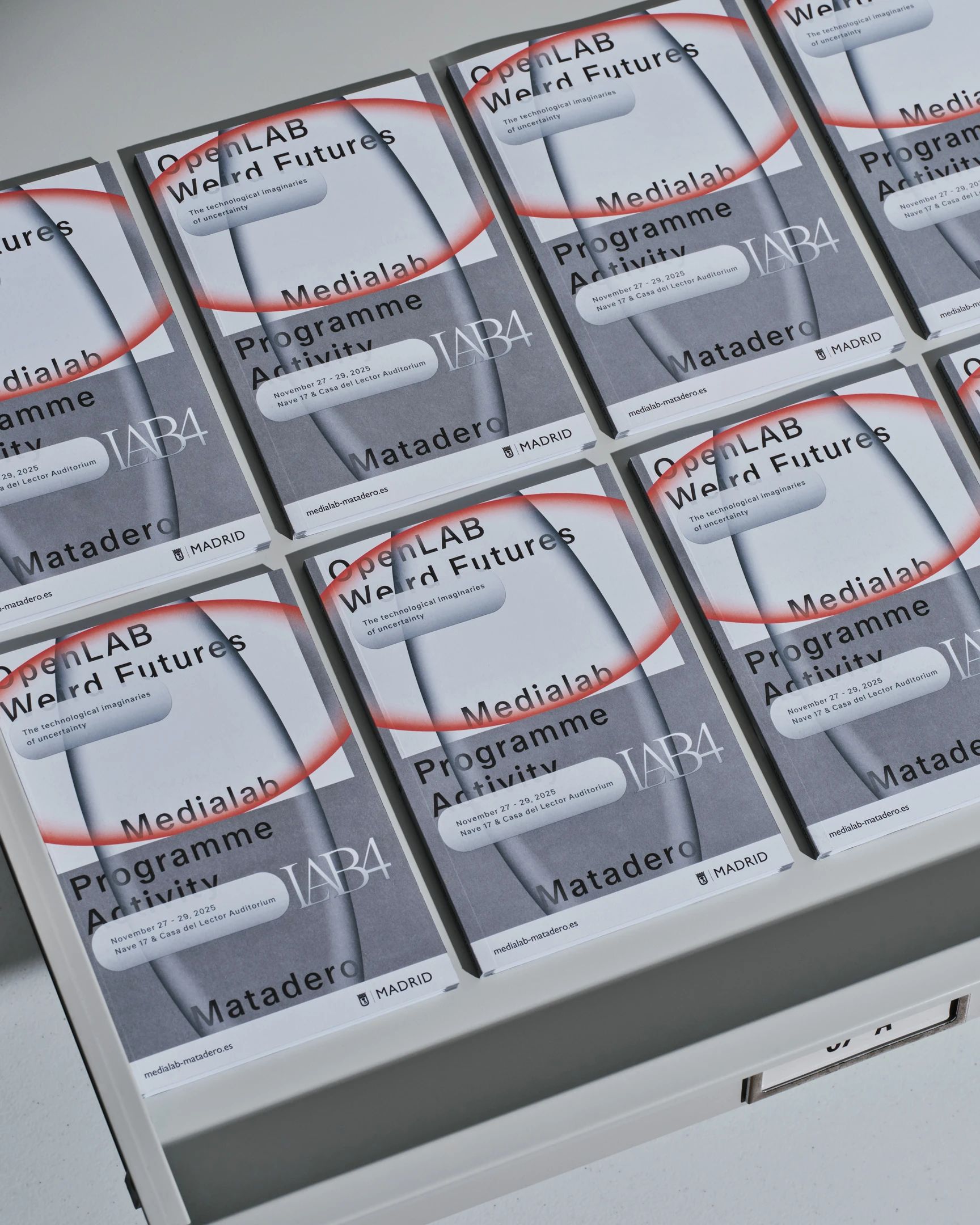
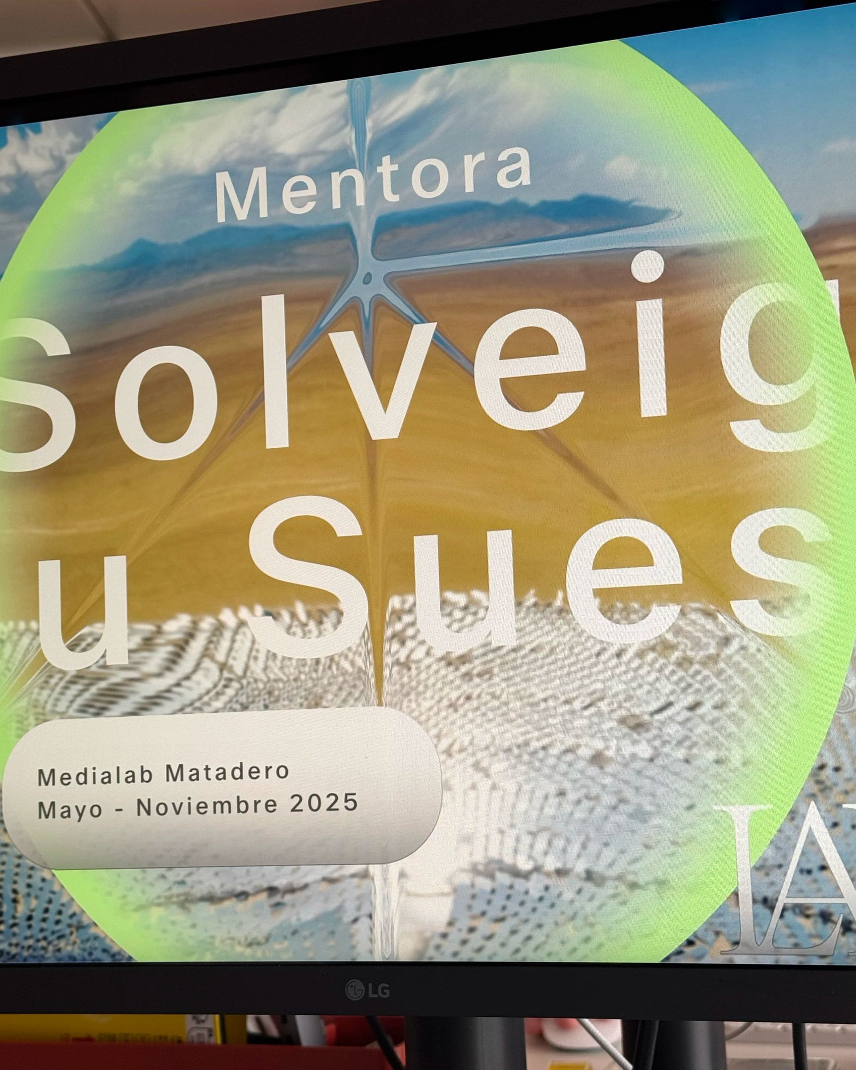
Medialab Matadero
World Food Programme
Sala Razzmatazz
Museu Picasso
Zara
Museu Picasso
Barcelona Design Week
Merca Rar
Barcelona Centre de Disseny
Making Time Studio
Palau Robert
Zara
Museu Picasso
Bajet Giramé
Memorial Democràtic
Barcelona Design Week
Medialab Matadero
World Food Programme
Sala Razzmatazz
Museu Picasso
Zara
Museu Picasso
Barcelona Design Week
Merca Rar
Barcelona Centre de Disseny
Making Time Studio
Palau Robert
Zara
Museu Picasso
Bajet Giramé
Memorial Democràtic
Barcelona Design Week

Project InfoClose
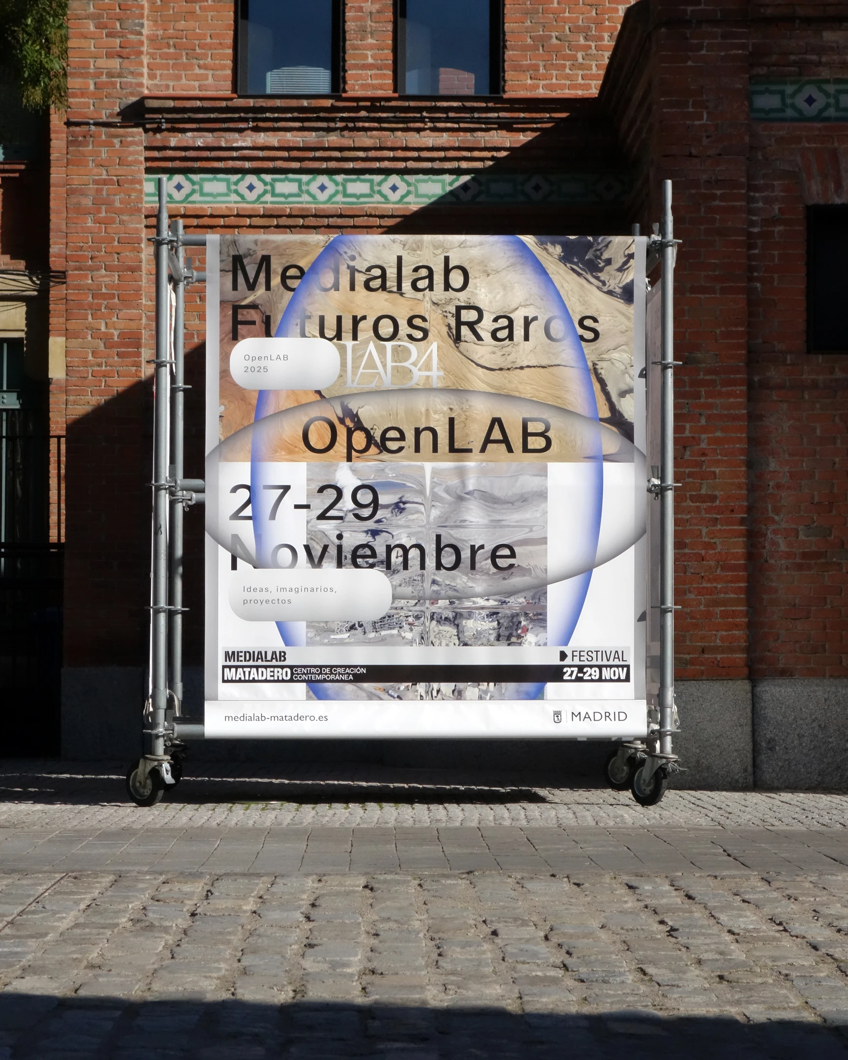
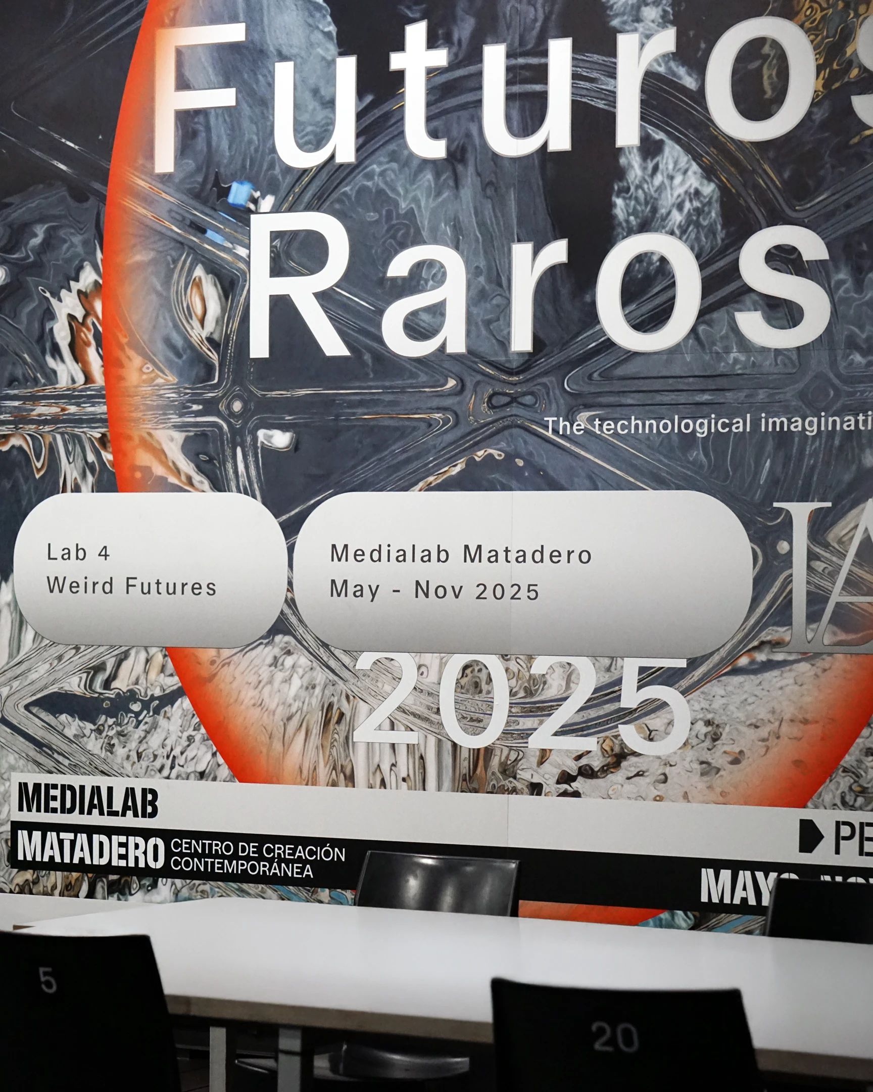
Developed for Medialab Matadero across physical, printed and digital formats, the campaign drew on distorted landscapes, coded visual fragments and atmospheric visions of the future to frame what lies ahead as something unstable, immersive and still to be decoded.
A speculative campaign for future landscapes
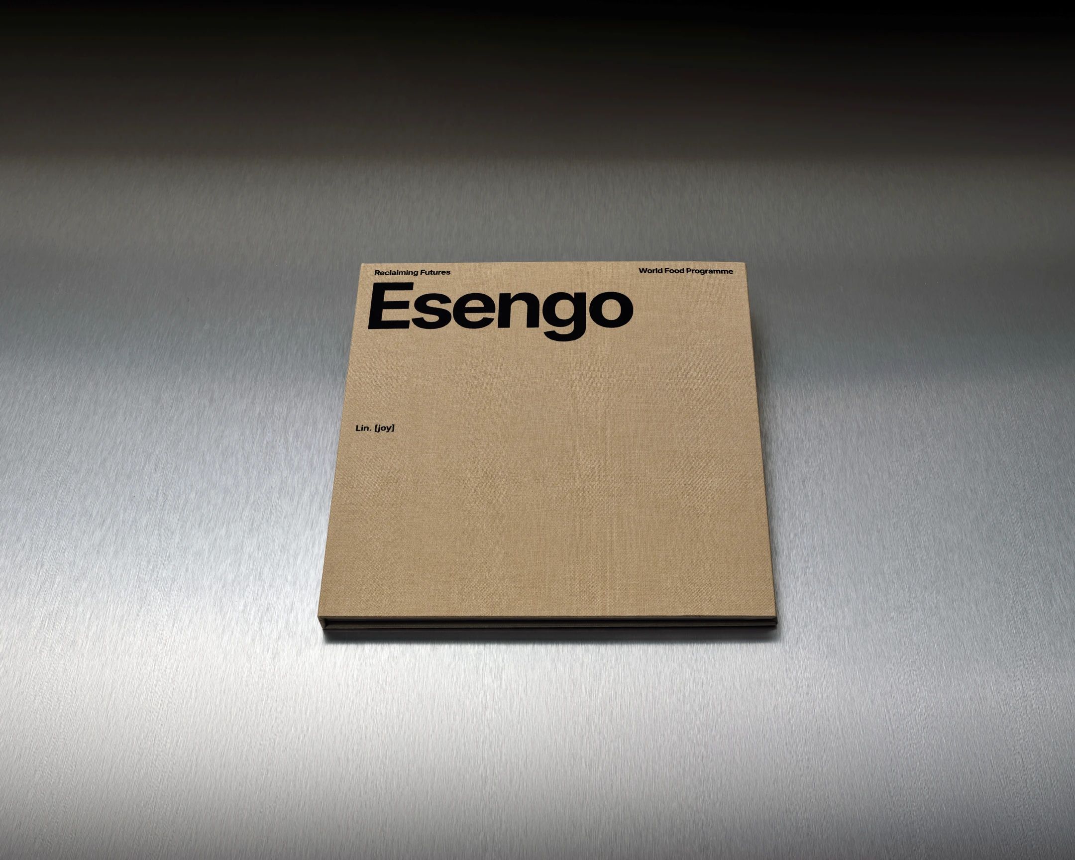
Created for the World Food Programme, Esengo was conceived as a book that could be read as much through image, rhythm and material contrast as through text. Structured around inserted chapters carrying each subject’s story, the publication allowed the photographic sequences to unfold with greater autonomy, using shifts in paper, texture and weight to produce a quieter, more layered reading experience.
Turning stories into a tactile narrative
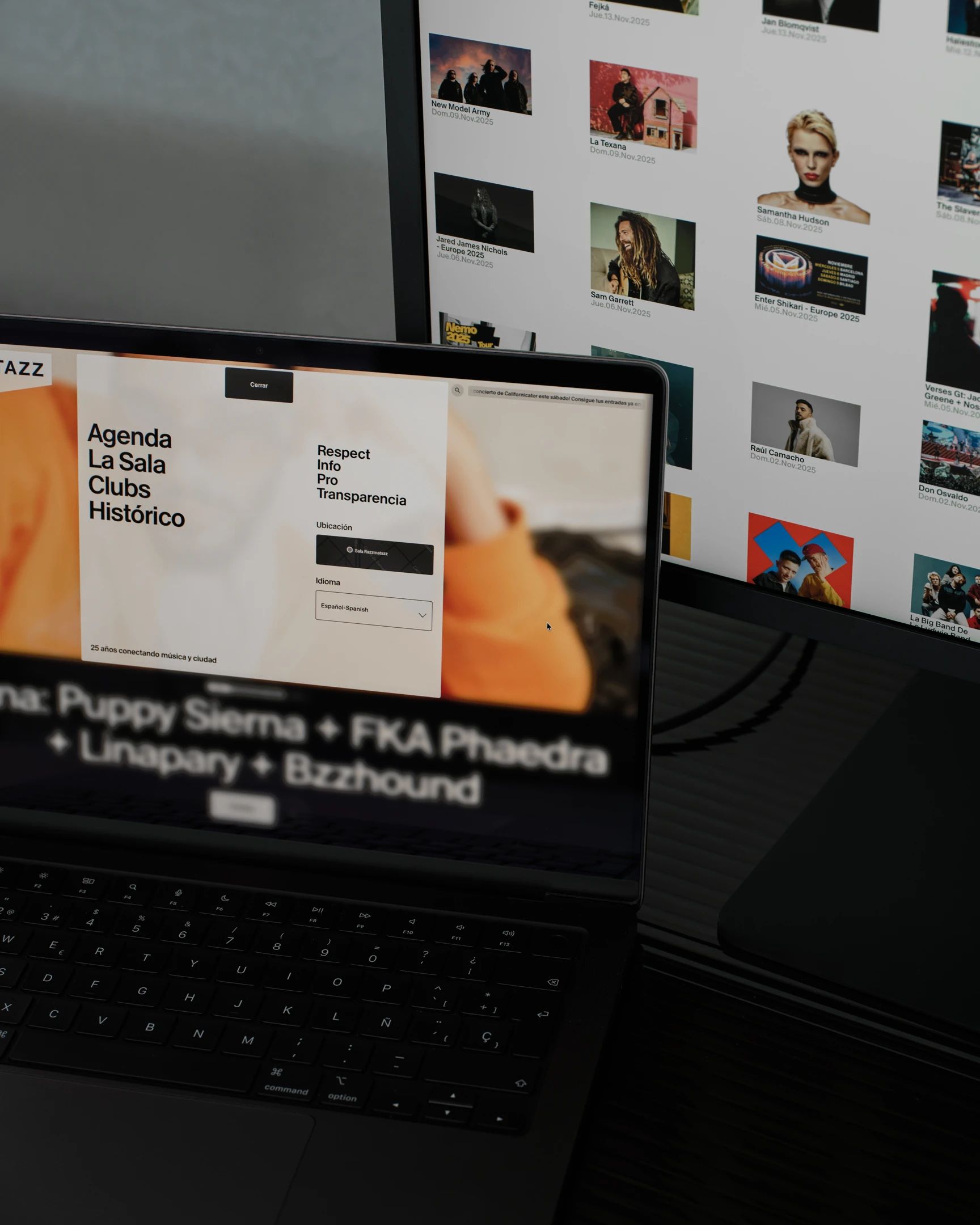
A new digital platform for Sala Razzmatazz, conceived to translate the energy and cultural relevance of one of Barcelona’s most iconic venues into a more contemporary digital experience. Bringing together programming, editorial depth and usability, the project balanced clarity and function with a visual language that felt current, confident and open to the city’s wider cultural scene.
Reframing a cultural landmark through a new digital experience
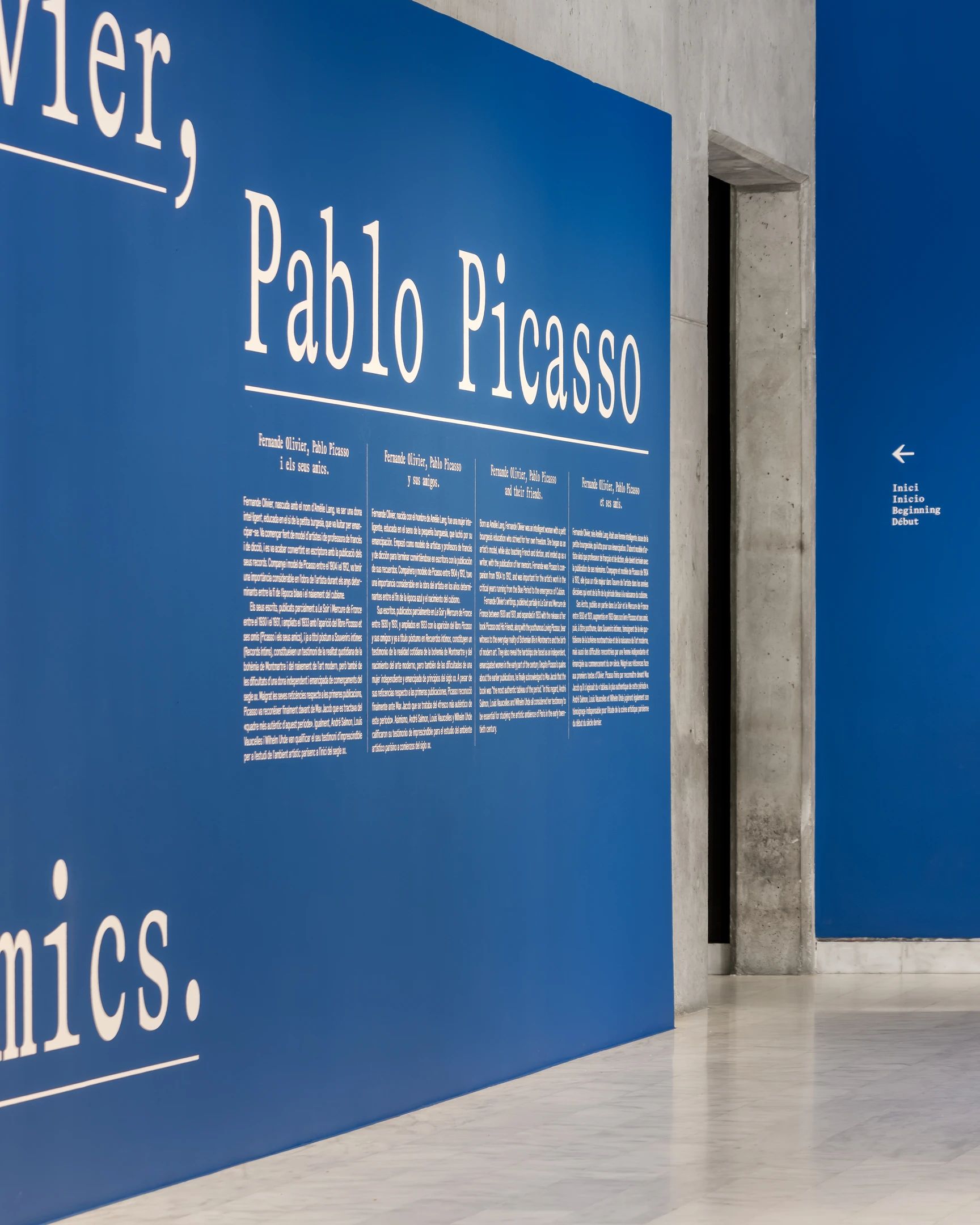
For Museu Picasso, we developed an exhibition design shaped by Fernande Olivier’s role as both subject and writer. A strong typographic presence, built around a serif monospaced typeface and underscored textual elements, framed the narrative voice of the exhibition, while the colour palette drew from a key sketchbook of drawings from the period, grounding the spatial language in the atmosphere of Picasso’s early world.
Staging Picasso’s world through Fernande Olivier’s eyes
An experimental campaign for Zara Join Life, built around ideas of process, commitment and transformation. Through a broad mix of techniques, textures and image treatments, the project proposed a more experimental visual language for upcycling, collective effort and the values embedded in the making of each piece.
A visual language for upcycling, craft and future-facing fashion
Designed for Museu Picasso, this exhibition catalogue brought together artworks, archival images, family photographs, sculpture and texts within a visual language shaped by intimacy, domestic life and artistic proximity. Drawing on the world Françoise Gilot and Pablo Picasso built at La Galloise, the publication used contrast, transparency and subtle optical effects to produce a reading experience that felt both delicate and layered.
A publication framing family life within an artistic universe
Created for the eighteenth edition of Barcelona Design Week, the campaign unfolded across print, digital and spatial formats through a graphic language shaped by experimentation, motion and transformation. Using the figure of eighteen as a generative device, the project constructed a visual world that felt bold, unstable and directed towards the future.
A campaign proposing design as the 18th sustainable development goal
For Merca Bae, we developed the creative direction and vinyl design for Merca Rar, using the idea of digital compression as a starting point for a more industrial visual language. Built around a buckle-like form that merged the letter M with the logic of a compressed file, the project translated club culture and digital artefacts into a physical object with a sharper, more sculptural presence.
Club culture with mechanical precision
For Barcelona Centre de Disseny, we developed the art direction for a commemorative book marking fifty years of the institution through a timeline-based editorial structure. Alongside this chronological thread, two key inserted sections brought together decades of BCD annual reports and Barcelona Design Week campaigns, turning the publication into both a record of institutional history and a layered portrait of Barcelona’s design culture.
Tracing the memory of a design institution
For Making Time Studio, we developed a website conceived as a digital platform for navigating sound work across commercial and cultural contexts. Blending portfolio, archive and interface, the project used transparency, lightness and an almost app-like visual logic to create a more fluid, editorial way of moving through music, rhythm and sonic atmosphere.
A portfolio website conceived as a listening experience
For Palau Robert, we developed the art direction and exhibition design for Nova Pantalla, an immersive exhibition on the strength and reach of Catalonia’s video game industry. Rather than relying on familiar gaming clichés, the project built a more futuristic spatial language through light, interface-inspired symbols and phase-based environments, framing the exhibition as a journey through creators, professions, technologies and new forms of cultural production.
Mapping Catalonia’s game culture through immersive exhibition design
For Zara, we designed Past and Future Fabrics, a catalogue-swatchbook conceived to accompany the exhibition and extend its spatial logic into print. Structured through a clear system of technical fiches, the publication organised materials, suppliers, weights and compositions within a precise editorial framework, turning textile information into a quieter, more methodical visual language.
Turning textile data into a precise editorial object
For Museu Picasso, we developed the exhibition design for Créixer entre dos artistes, an exhibition centred on the domestic and emotional world in which Claude and Paloma Picasso grew up. Conceived with a restrained and intimate spatial language, the project brought together artworks, archival material and family narratives to frame childhood, artistic proximity and everyday life as part of a shared world shaped by two artists.
An exhibition on artistic upbringing, family life and everyday intimacy
For Bajet Giramé, we developed a brand identity and website shaped by the studio’s editorial sensibility and its precise, materially grounded approach to architecture. Built around the initials BG, the project introduced an archival coding system that became both a visible feature of the digital experience and a functional tool for organising the studio’s body of work from within.
An editorial identity for an architecture practice
For Memorial Democràtic, we developed the exhibition design, communication campaign and display system for Ni Déu, ni Estat, ni patró, using a visual language shaped by the force, friction and radical character of anarchist culture. Built through bold typography, expressive lettering and a more industrial spatial atmosphere, the project translated political urgency and collective energy into an exhibition experience that felt direct, raw and historically charged.
An exhibition staging anarchism through graphic force and industrial tension
Created for Barcelona Design Week 2025, this campaign unfolded across physical, editorial and digital formats through a visual language built around the idea of creative resilience. Structured compositions and luminous graphic frameworks were used to hold soft, atmospheric imagery, proposing a more hopeful and future-oriented visual field without losing clarity, tension or precision.
Imagining creative resilience as structure and hope
Developed for Medialab Matadero across physical, printed and digital formats, the campaign drew on distorted landscapes, coded visual fragments and atmospheric visions of the future to frame what lies ahead as something unstable, immersive and still to be decoded.
A speculative campaign for future landscapes
Created for the World Food Programme, Esengo was conceived as a book that could be read as much through image, rhythm and material contrast as through text. Structured around inserted chapters carrying each subject’s story, the publication allowed the photographic sequences to unfold with greater autonomy, using shifts in paper, texture and weight to produce a quieter, more layered reading experience.
Turning stories into a tactile narrative
A new digital platform for Sala Razzmatazz, conceived to translate the energy and cultural relevance of one of Barcelona’s most iconic venues into a more contemporary digital experience. Bringing together programming, editorial depth and usability, the project balanced clarity and function with a visual language that felt current, confident and open to the city’s wider cultural scene.
Reframing a cultural landmark through a new digital experience
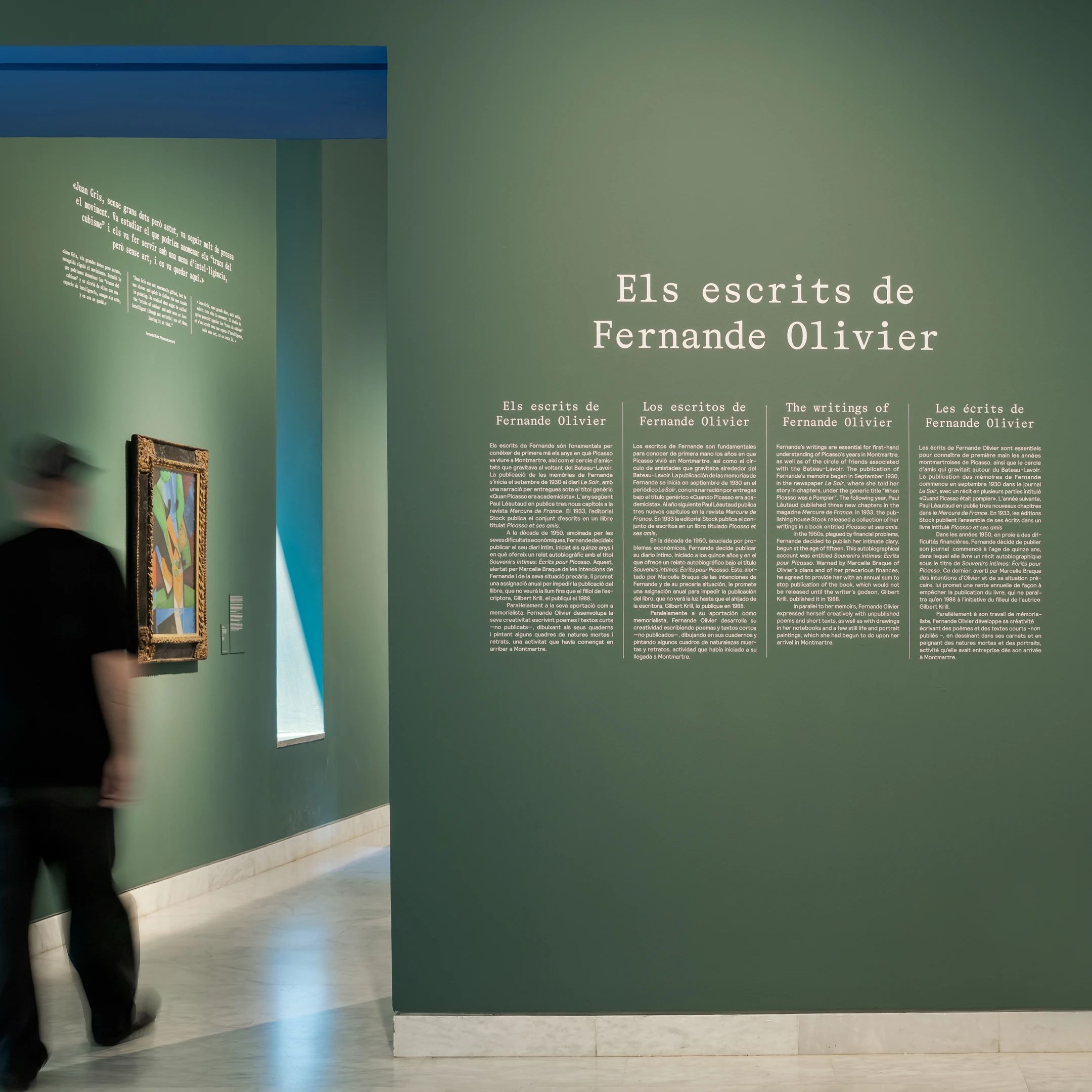
For Museu Picasso, we developed an exhibition design shaped by Fernande Olivier’s role as both subject and writer. A strong typographic presence, built around a serif monospaced typeface and underscored textual elements, framed the narrative voice of the exhibition, while the colour palette drew from a key sketchbook of drawings from the period, grounding the spatial language in the atmosphere of Picasso’s early world.
Staging Picasso’s world through Fernande Olivier’s eyes
An experimental campaign for Zara Join Life, built around ideas of process, commitment and transformation. Through a broad mix of techniques, textures and image treatments, the project proposed a more experimental visual language for upcycling, collective effort and the values embedded in the making of each piece.
A visual language for upcycling, craft and future-facing fashion
Designed for Museu Picasso, this exhibition catalogue brought together artworks, archival images, family photographs, sculpture and texts within a visual language shaped by intimacy, domestic life and artistic proximity. Drawing on the world Françoise Gilot and Pablo Picasso built at La Galloise, the publication used contrast, transparency and subtle optical effects to produce a reading experience that felt both delicate and layered.
A publication framing family life within an artistic universe
Created for the eighteenth edition of Barcelona Design Week, the campaign unfolded across print, digital and spatial formats through a graphic language shaped by experimentation, motion and transformation. Using the figure of eighteen as a generative device, the project constructed a visual world that felt bold, unstable and directed towards the future.
A campaign proposing design as the 18th sustainable development goal
For Merca Bae, we developed the creative direction and vinyl design for Merca Rar, using the idea of digital compression as a starting point for a more industrial visual language. Built around a buckle-like form that merged the letter M with the logic of a compressed file, the project translated club culture and digital artefacts into a physical object with a sharper, more sculptural presence.
Club culture with mechanical precision
For Barcelona Centre de Disseny, we developed the art direction for a commemorative book marking fifty years of the institution through a timeline-based editorial structure. Alongside this chronological thread, two key inserted sections brought together decades of BCD annual reports and Barcelona Design Week campaigns, turning the publication into both a record of institutional history and a layered portrait of Barcelona’s design culture.
Tracing the memory of a design institution
For Making Time Studio, we developed a website conceived as a digital platform for navigating sound work across commercial and cultural contexts. Blending portfolio, archive and interface, the project used transparency, lightness and an almost app-like visual logic to create a more fluid, editorial way of moving through music, rhythm and sonic atmosphere.
A portfolio website conceived as a listening experience
For Palau Robert, we developed the art direction and exhibition design for Nova Pantalla, an immersive exhibition on the strength and reach of Catalonia’s video game industry. Rather than relying on familiar gaming clichés, the project built a more futuristic spatial language through light, interface-inspired symbols and phase-based environments, framing the exhibition as a journey through creators, professions, technologies and new forms of cultural production.
Mapping Catalonia’s game culture through immersive exhibition design
For Zara, we designed Past and Future Fabrics, a catalogue-swatchbook conceived to accompany the exhibition and extend its spatial logic into print. Structured through a clear system of technical fiches, the publication organised materials, suppliers, weights and compositions within a precise editorial framework, turning textile information into a quieter, more methodical visual language.
Turning textile data into a precise editorial object
For Museu Picasso, we developed the exhibition design for Créixer entre dos artistes, an exhibition centred on the domestic and emotional world in which Claude and Paloma Picasso grew up. Conceived with a restrained and intimate spatial language, the project brought together artworks, archival material and family narratives to frame childhood, artistic proximity and everyday life as part of a shared world shaped by two artists.
An exhibition on artistic upbringing, family life and everyday intimacy
For Bajet Giramé, we developed a brand identity and website shaped by the studio’s editorial sensibility and its precise, materially grounded approach to architecture. Built around the initials BG, the project introduced an archival coding system that became both a visible feature of the digital experience and a functional tool for organising the studio’s body of work from within.
An editorial identity for an architecture practice
For Memorial Democràtic, we developed the exhibition design, communication campaign and display system for Ni Déu, ni Estat, ni patró, using a visual language shaped by the force, friction and radical character of anarchist culture. Built through bold typography, expressive lettering and a more industrial spatial atmosphere, the project translated political urgency and collective energy into an exhibition experience that felt direct, raw and historically charged.
An exhibition staging anarchism through graphic force and industrial tension
Created for Barcelona Design Week 2025, this campaign unfolded across physical, editorial and digital formats through a visual language built around the idea of creative resilience. Structured compositions and luminous graphic frameworks were used to hold soft, atmospheric imagery, proposing a more hopeful and future-oriented visual field without losing clarity, tension or precision.
Imagining creative resilience as structure and hope
Layered
Structured